A Transit Map is a topographic map that shows the routes and stations within a public transport system. This particular Transit Map is a Web Trend Map made by Internet Architects in Japan.The different colors in this map represent different site categories.
Tuesday, July 24, 2012
Pictorial Maps

A Pictorial Map is a map that depicts an area in more of an artistic fashion. This maps typically are shown above at an oblique angle. This particular map is a pictorial map of Boston, Massachusetts.
Dymaxion map

A Dymaxion map is a map projection onto the surface of a icosahedron. An Icosahedron is a polyhedron with 20 equilateral triangles. This map makes the world look like one island as opposed to multiple continents.
Reversed Map

Monday, July 23, 2012
DLG

DLG mapping is a cartographic map represented in digital vector form that is distributed by the U.S. Geological Survey. Digital Line Graphs are formatted to work with GIS technology and mapping applications. This particular map is of Athens Georgia.
DRG

Digital raster graphic (DRG) is a digital image resulting from scanning a paper of a topographic map for use on a computer. DRG maps are primarily used with GIS technology. This particular map shows the topography of Michigan.
Isopleths

An Isopleth map uses lines joining points of an equal value to show variations in that value. This particular map portrays wind velocity by month around the Columbia River. This Map is considered an Isopleth because it has lines joining the points of equal value though out the months.
Similarity matrix

A Similarity Matrix is a matrix of scores which express the similarity between two data points. This particular Similarity Matrix is used to find out the BMI of a person.
Isohyets

| Isoyet Maps use lines on a map that connect points having the same amount of rainfall in a given period. This map shows the rainfall around Hong Kong. |
Parallel coordinate graph

A Parallel coordinate graph uses coordinates or variables and graphs them on an axis. Lines are then put through all of these points. This particular parallel coordinate graph shows the cells of nine different genes.
Triangular Plot

A Triangular Plot depicts a equilateral triangle with three different variables. The Triangular plot above shows what people in the UK vote for.
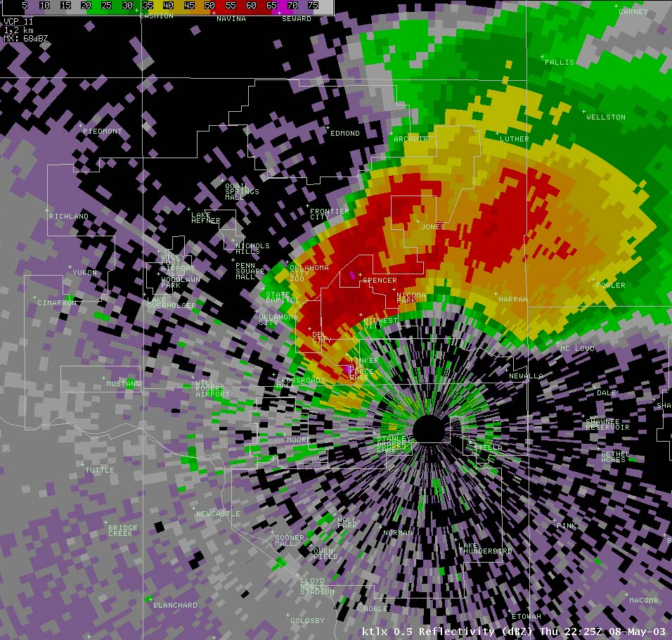
Doppler Radar
Wind rose

A Wind rose is a tool that sees how wind speed and direction are distributed in an area. These are the predecessors of the compass.
Black and White Aerial Photo

Black and White Aerial Photos are taken from above and absorb all colors other than black and white. These photos are great for urban planning and real estate.
Climograph

A Climograph conveys the monthly average temperature and precipitation, at a certain location. This particular Climograph portrays the precipitation and temperature of boulder Colorado. Reading the Climograph is pretty easy, all you have to do is pick the month you want to know the precipitation and temperature and see what the amount was.
Infrared aerial photo

Infrared Aerial photos are photos that are taken using remote sensing from above. The photo posted is an aerial map of Sonoma County. These pictures could show vegetation, buildings, etc..

Cartographic animations

Cartographic animations portray movement on a map that would be normally to difficult to convey to a person. A good example of such is the maps used on the weather channel on tv. This map is showing wind velocity magnitudes at 500 mb height with wind vectors.
Index Value Plot

A Index Value Plot is a type of map that uses an index value that's plotted on a line graph. This map portrays the steam flow from February to March in North Carolina in the year 2009.

Bilateral Graph

A Bilateral graph compares two variables side by side, typically in a bar graph. This graph has Percent correct compared against multiple months. The data provided is for the right ear, the left ear and both ears. Because of it having two axis comparing against each other, this graph is considered Bilateral.
Nominal area choropleth map

A Nominal Area Choropleth Map is a Choropleth map that conveys nominal information. The map that I posted shows the minority groups with the highest precent of state population. This map is a nominal map because of its use of race as its variables.
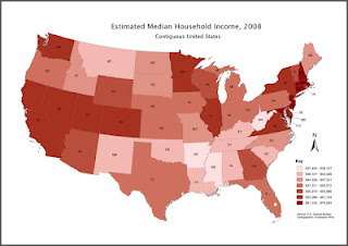
Standardized choropleth maps

A Standardized Choropleth Map is a Choropleth map that has its data standardized so it can be used for comparison. The map posted portrays the population per square mile by state using data form the 2000 census. This map is a standardized map because of its use of 2000 census figures.
Statistical Map

A statistical map is a map in which the variation in the quantity of a factor is displayed. These maps convey factors such as such as percent of snowfall within different areas. This particular map uses a color scale to portray the information. This is a statistical map because it conveys information from the U.S Census Bureau throughout the U.S.
Choropleth map

Dot Distribution Map

A Dot Distribution Map is a map that uses a dot symbol to measure things. These maps convey the presence of a feature or phenomenon. This is a Dot Distribution Map because it shows where feed watchers are in the US. By looking at this, we can tell that they are more abundant in the New England area.
Univariate choropleth maps
Bivariate Choropleth maps

A Bivariate Choropleth map is a variation of the standard choropleth map that displays two variables on a single map by combining two different sets of graphic symbols or colors. This map conveys population density in 2002 and population change between 1989-2002 in Russia's Central Federal District. This map is considered a Bivariate because of its display of population and population change through color.
Unclassed choropleth maps

An Unclassed Chloropleth map is similar to to a Chloropleth map, only it does not have set intervals. This means that there could potentially be hundreds of colors to represent variables unlike the classed chloropleth map, which usually has a small, fixed amount. This map shows a country with multiple colored regions with no fixed interval. This is considered a unclassed chloropleth map because of its multiple colored regions with no fixed intervals.
PLSS Map

The Public Land Survey System (PLSS) is a way of subdividing and describing land in the United States that makes all land that is in public domain subject to subdivision.The original public domain included the land given up by the thirteen original states This map portrays the PLSS in use.
Range graded proportional circle map

Continuously variable proportional circle map

http://geographyfieldwork.com/DataPresentationMappingTechniques.htm
A Continuously variable proportional circle map uses circles or pi charts that are proportional to the size of circle/pi chart. The map posted shows population of different areas in the Czech Republic. This map is considered a continuously variable proportional circle map because of its is use of pi charts that range in size that are proportional to the population of the regions.
DOQQ

A Digital Orthophoto Quarter Quads (DOQQ) portrays digital aerial that contain orthorectified aerial photography at a resolution of 1 meter. This map is a DOQQ of Johnston County between January 1998 to March 1998. This map is considered a DOQQ because of its use of digital aerial and othorectified ariel photography.
Box Plot

A Box Plot is a display of 5 significant numbers which are maximum , minimum, upper quartile, lower quartile, and median. Box plots show us how data is distributed and can also show outliers. This particular Box plot shows lottery payouts over an amount of time.
DEM
A DEM is a 3d map of the terrain of an area using data obtained by LIDAR, Doppler radar etc.. This map conveys the land around Sturgis, South Dakota. This map is considered a DEM because of its use of GIS technology to obtain data that was formed together to make a 3d image.
Isotach Map
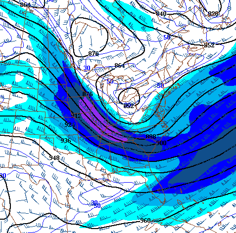
An isotach map is one that consists of contour lines displaying equal wind speeds. The map above conveys the different wind speeds of the area. This map is an Isotach Map because it uses different colors and shades to show the different wind speeds.
Star Plots

A Star plot is method of mapping multivariate data into stars. Each of these stars represents a single observation. This map conveys different information on 16 cars made in 1979. This map is a Star plot because of its use of stars to illustrate the information about these cars.
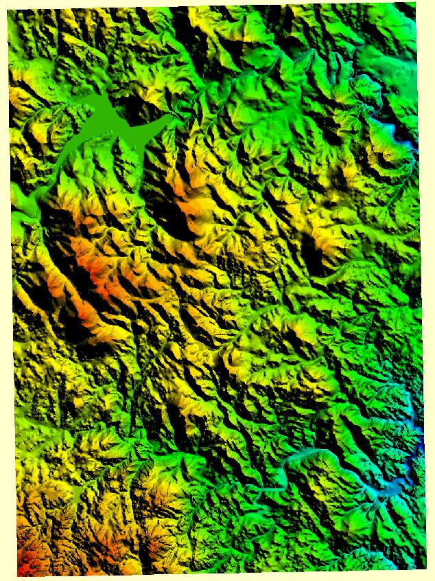
Hypsometric Map

A Hypsometric Map is a map that gives elevation by contours, or sometimes by means of shading, tinting, or batching. This map shows the different elevations through tints. This is a Hypsometric Map because the different elevations all receive a different tint.
Cartograms

A Cartogram is a map that distorts the geometry or space of the map to portray a variable. This map conveys human population of the world. This map is considered a Cartogram because it has certain countries bloated to show that they have large populations.
Sunday, July 22, 2012
Propaganda Map

A Propaganda Map is used for the intent of threat, exploitation, or to emphasize something. This Propaganda Map was used by Ronald Reagan to convey how he felt the world was during The Cold War. This is a Propaganda Map because it is a false map that was crafted to portray feelings.
Cadastral Map

A Cadastral map shows the boundaries and ownership of land parcels. The map provided conveys the land of Costa Rica. This is considered a Cadastral map because it portrays the boundaries and ownership of Costa Rica.
Planimetric Map

A Planimetric map shows only the horizontal positions of features on the Earth's surface This map of Kentucky conveys only the horizontal positions of features. It is considered a Planimetric Map because you can't determine the elevation of anything since its only drawn with horizontal lines.
Thematic Map

A Thematic Map is a map that shows a theme of a particular area. This map conveys the land reserves of the Hawaii. This is considered a thematic map because this map follows the general theme of land reserves of Hawaii.
Topographic Map

A Topographic map that is characterized by contour lines that details the natural and man made aspects of the land of an area. This map conveys an area of land west of the Mississippi River. This is considered a Topographic map because of its use of contour lines to show relief areas in the land.
Mental Map

A Mental Map is a map that is created in a person's mind through use of their emotions, memories and other information from their life. This map conveys what a homeless man thinks amsterdam looks like to him. This is considered a mental map because this was formed by a man through the image of Amsterdam in his mind.
Scatterplot Map

A Scatterplot map displays two variables for a set of data in the form of points. This map conveys Arm strength of a person compared to Grip strength. This map is a scatter plot because the two variables are arm strength and grip strength and it is in the form of points.
Stem and Leaf Plot

A Stem and Leaf Plot is a graph used to present quantitative data in a graphical form to assist in visualizing the shape of a distribution. The are very useful for find outliers and the mode of a set of data. This plot conveys per capita GNP of Western Africa. This map is a Stem and Leaf Plot because it conveys GNP of Western Africa in a graphical format to aid in visualizing the shape of distribution.
Histogram

Webster's dictionary says that a histogram is a representation of a frequency distribution by means of rectangles whose widths represent class intervals and whose areas are proportional to the corresponding frequencies. This map conveys the amount of employees in a company and what these employees salaries are. This map is a histogram because its representing salary in rectangles whose widths represent class intervals and whose areas are proportional to the number of employees.
Isopach

An Isopach Map is a map illustrating variation of thickness within a tubular unit or stratum. This map conveys sediment overburden and distribution off off-shore coal oil. This map qualifies as an Isopach because it conveys a distribution of ocean strata.
Sunday, July 1, 2012
Flow Map

A flow map llustrate social or economic exchange by use of lines and curves connection points of origin and destination. This map portrays flight patterns and the noise it produces. Because of this map showing flight patterns portrayed by lines and curves, this makes this a flow map
Subscribe to:
Comments (Atom)